
Key Takeaways
- A high-converting landing page drives one specific action. Every element on the page should serve that single goal.
- The median landing page converts at 6.6 percent across all industries. Your target should reflect your vertical, since averages range from under 2 percent in ecommerce to over 10 percent in other industries.
- Tools like Unbounce’s Smart Copy speed up copy iteration, and its Smart Traffic feature dynamically routes visitors to the variant most likely to convert. Human review is still what catches poor-quality output, however.
- Cart abandonment averages over 70 percent industry-wide. Landing page sign-up and checkout flows suffer from similar friction.
- High-converting landing pages follow six core formats: text-only, lead generation, click-through, long-form, video, and SEO. Each format serves different goals, so choose yours based on the action you want visitors to take.
Ever wondered why your landing page pulls in traffic but barely converts anyone?
You’re not alone.
The median landing page converts about 6.6 percent of visitors, and plenty of pages fall well below that.
The problem is rarely traffic or budget. It’s the page.
Effective landing pages follow a proven structure, with every element earning its place through testing. I’ll walk you through how that process works so you can stop guessing and start optimizing with a clear plan.
What Is a High-Converting Landing Page?
A high-converting landing page is a webpage that excels at getting visitors to take one specific action. That could be signing up for a newsletter, registering for a webinar, claiming a discount, making a purchase, or downloading your app.
Here’s an example from Revolut that directs visitors to download the digital banking company’s app:
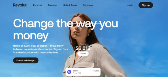
A strong landing page turns visitors into new subscribers and fresh leads, which you can nurture through your sales funnel until they’re ready to buy.
Core elements include a compelling call to action (CTA), a sign-up form, an attention-grabbing headline, and subheadings. It also contains easy-to-read content, images, and perhaps a video.
High-priority elements like your sign-up form should go above the fold (the visible part of the webpage when you first see it) for maximum visibility. I’ll cover placement strategy in more detail later.
Types of High-Converting Landing Pages
High-converting landing pages come in several formats. Here are the ones worth knowing about.
Text-Only Landing Pages
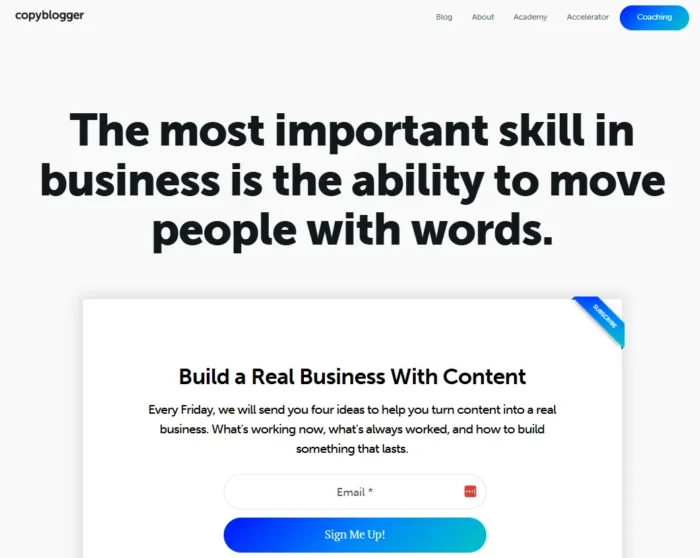
These skip the videos and heavy graphics, relying on copy and a few supporting images to keep the focus on the message.
Copyblogger is a strong example that pairs minimal visuals with a clear CTA button.
Lead Generation Landing Pages
Lead generation landing pages collect details such as a name, email, and phone number. The idea is to turn prospects into leads by offering a free lead magnet, such as templates, a short course, eBooks, or access to a webinar.
This is how Workhuman uses them:
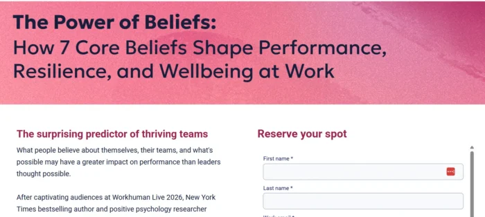
Although the form is relatively extensive (with several additional fields out of view), it makes segmenting and targeting easier. Its basic but striking design keeps it clutter-free while relaying the essential information.
Click-Through Landing Pages
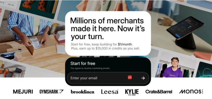
Click-through landing page conversions aim to get people to take an action, such as signing up for a freebie, requesting a product demo, registering for an event, or buying a product. Typical features include a clear CTA, an engaging headline, and magnetic content designed to persuade the reader.
Shopify uses an enticing discount offer for new users and features a single-field sign-up form and a simple yet tempting CTA button.
Long-Form Landing Pages
A long-copy landing page is common in the digital marketing industry. It’s a go-to format for showcasing the benefits of your products or services to close a sale.
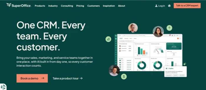
These longer pages use strong headlines and subheadings, features and benefits, images, social proof (e.g., reviews), and CTAs throughout. They might also include case studies, trust badges, and a video chat option, as SuperOffice does.
Video Landing Pages
Video landing pages feature video as the primary content element.
Why? Video can improve engagement and conversions and reduce bounce rate by keeping visitors on the site longer. It also builds trust with prospects before they commit.
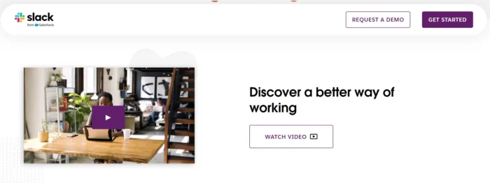
This format works well for products or services that require setup or configuration. When you visit Slack, for example, you’ll find a video that walks you through what the messaging software does and how to use it.
Video also brings reach. Digital video has a worldwide audience of 3.88 billion, just over 63 percent of whom watch on smartphones.
Demand keeps growing, too.
A Wyzowl survey finds that 84 percent of consumers want more videos, and 96 percent have watched an explainer video to learn about a product or service.
Campaign vs. SEO Landing Pages
You can build landing pages for two broad purposes: long-term organic visibility or short-term campaign performance.
An SEO landing page targets organic traffic by answering specific search queries. These pages need ongoing optimization to maintain rankings.
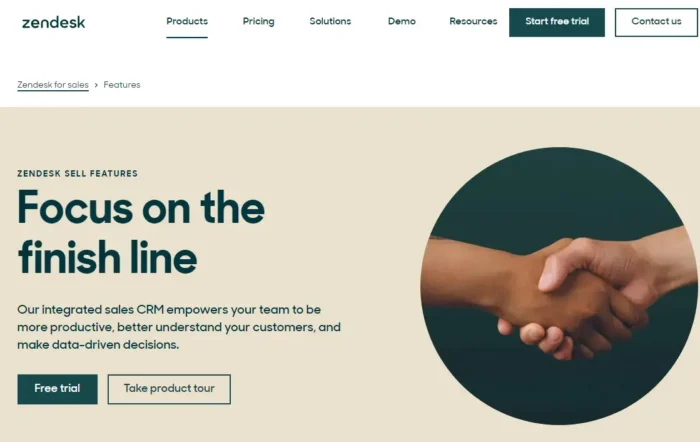
Zendesk, for example, uses a clean, structured features page with short text paragraphs and updates it regularly as new product features roll out.
A campaign landing page supports a specific product launch or marketing push. It relies on paid advertising to drive targeted traffic and uses frequent A/B testing to find the best-performing version.
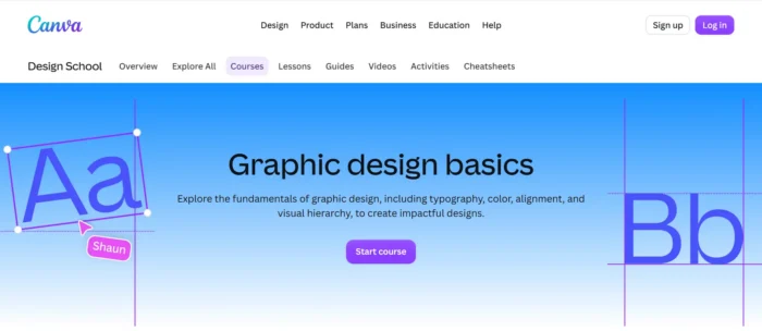
Here’s an example from Canva, which uses a campaign landing page to promote a free graphic design course and drive sign-ups through its Design School.
How to Create a High-Converting Landing Page
Here’s my five-step process to build a strong landing page.
1. Choose Your Tools
Several tools can help you start building landing pages:
- Unbounce: A drag-and-drop landing page builder with no-code A/B testing, AI-powered copywriting, and real-time analytics. Free 14-day trial.
- OptimizePress: A WordPress-based builder for conversion-optimized landing pages, funnels, and membership sites. 14-day money-back guarantee.
- Instapage: A landing page platform for building, optimizing, and scaling personalized pages. Free 14-day trial on Create and Optimize plans.
- Leadpages: A builder with optimized templates, lead magnet delivery, and built-in analytics. Free seven-day trial.
- GetResponse: A marketing platform with a drag-and-drop landing page creator and AI content generator. Free 14-day trial.
- PopUp Domination: A pop-up tool that adds email opt-in forms to your landing pages to capture more subscribers. Works with every web host and email provider. Free 14-day trial.
- OptinMonster: A lead capture tool that adds pop-ups, slide-ins, and other opt-in forms to your pages to grow your email list. 14-day money-back guarantee.
2. Conduct Market Research
Every good landing page starts with a thorough understanding of your target market and customers, so you can create value and provide a desirable customer experience.
Research your target market to understand what your customers need, the language they use, and what might prevent them from converting. That might be price concerns or unclear value, for example.
From there, dig into keyword research to find the search terms your audience uses, including long-tail keywords that signal high intent. Run a competitive analysis to see what’s already ranking and where the content gaps are.
My free tool, Ubersuggest, can help with all of this. Here, it shows keyword ideas for “Starbucks” broken into suggestions, questions, and prepositions, each with search volume data.
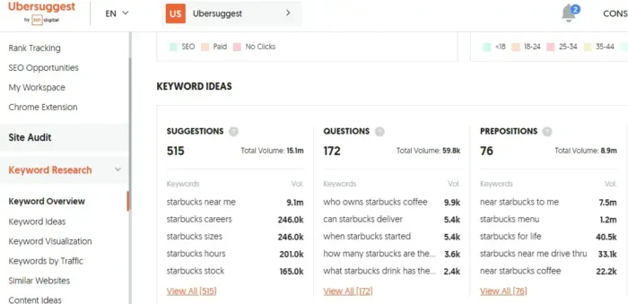
These categories help you understand how your audience searches for a topic so you can match your landing page copy to real user intent.
3. Design With Conversions in Mind
A high-converting landing page brings together several design elements that work toward a single goal. Here’s what the anatomy looks like:
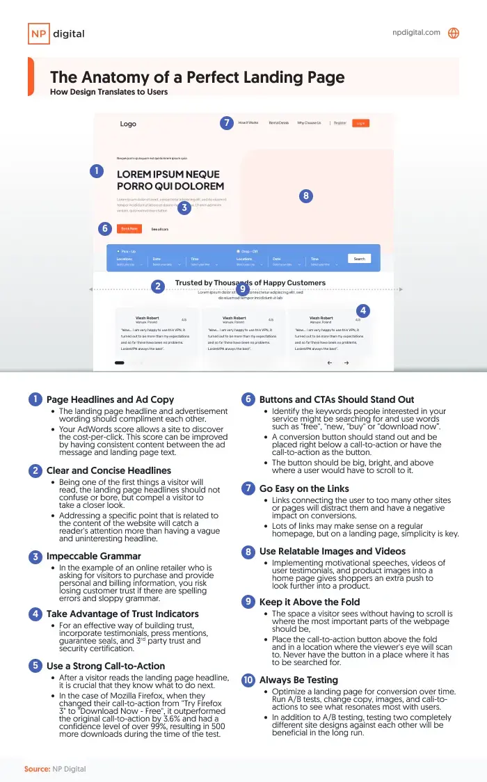
Some elements deserve extra attention:
- Headline: It’s the first thing people read, so make it bold, clear, and benefit-driven. It also needs to be creative and to the point while creating a sense of urgency. Alternatively, use it to target specific customers and offer a solution to their problems.
- Subheadlines: Take the same approach with subheadings and keep them short and direct. Ultimately, subheadings should reinforce the headline’s message and keep readers moving down the page.
- Call-to-action button: Your CTA button needs to stand out visually. Use a contrasting color and keep the text simple, with wording like “Download now” or “Buy now.”
- Videos and images: Showcase your product and feature testimonials with videos and imagery. Consider including a hero image (a large, eye-catching image that visitors will see first). Headshots also work well.
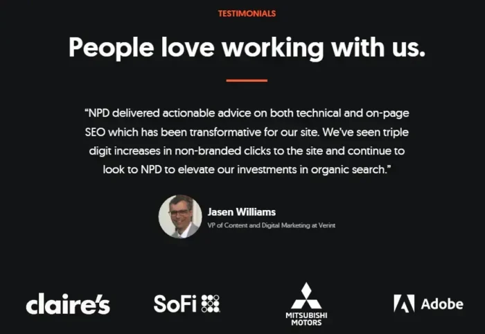
- Trust badges: Awards, trade badges, company logos, and testimonials are trust indicators that help reduce hesitation for visitors who are close to converting.
I cover more of these principles in my guide to what high-converting websites do differently.
4. Ensure Mobile-Friendliness
Mobile devices account for more than 50 percent of global web traffic and generate 70 percent of online shopping orders.
That’s why your landing page needs to work just as well on a phone as it does on a desktop.
Google recommends a few core practices for mobile landing pages:
- Keep the layout clutter-free, easy to read, and fast-loading. Google advises avoiding pop-ups.
- Include intuitive navigation like a “home” page button on every page and a drop-down menu.
- Create punchy, relevant copy with a clear tone.
- Consider using Google Sign-In to simplify data collection.
Google has more tips on optimizing your mobile landing page.
5. Test and Optimize
Testing page variations is how you go from guessing to knowing what works. It’s how you know which version converts best so you can use the results to inform future landing page designs. My A/B testing introduction covers the fundamentals.
Start by testing one variable at a time:
- Button colors or page backgrounds
- Long versus short sign-up forms
- Content order, images, or copy
Run each test for at least two weeks, then compare conversion and engagement rates to make data-driven decisions. Optimizely, Crazy Egg, and Hotjar all offer A/B testing tools. Check how your page renders across devices with MobileTest.me.
Here are some best practices for landing page optimization:
- Use a clear user interface: For your landing page to work, ensure the user interface uses simple navigation and other elements, nudging users toward one clear action. The focus is on your visitor, not you. Align every element on your landing page to appeal to the end user. David Risley’s landing page for Blog Marketing Academy is a great example.
- Use SEO: Optimize your landing page with keywords by performing keyword research and understanding search intent.
Keep a narrow focus as you optimize. The clearer and simpler your page, the more likely you’ll get someone to take the action you want.
Ryan McHugh, the director of CRO at NP Digital, puts it this way:
“One of the biggest mistakes site owners make when building landing pages is not having a clear, single focus for the page. Landing pages should have one primary objective, whether it’s capturing email addresses, getting sign-ups, or making a sale. When a page has too many distractions, including links, navigation options, or too much information, it can confuse visitors and decrease conversions. Keep the content blocks concise and relevant. Focus on a clear value proposition and be sure to place a consistent and action-oriented call to action prominently on your pages.”
A few ways to put that into practice:
- Move non-essential information to the “About” section.
- Keep forms short.
- Make the CTA the focal point and place secondary links below the fold.
Design Best Practices
Your color palette, typography, and visual hierarchy all affect whether visitors convert or bounce. Here are the design details to get right.
- Think about color psychology: Colors shape brand perception and influence buying decisions. If you’re using a solid background color, make sure the text contrasts enough to stay readable. A dark background needs light text, and vice versa.
- Use clean and legible fonts: The most popular fonts for a landing page are PP Neue Montreal, GT Super, Aeonik, and Inter, all chosen for readability and impact.
- Be selective with links: Every link on your landing page is a potential exit. If your goal is to capture leads, minimize outbound links and keep the focus on your CTA.
One more thing: Keep your visuals tidy and polished.
If you’ve spent more than 30 minutes on the internet, chances are you’ve seen one of those ads with an annoying GIF or clickbait headline like “Lose 50 lbs with this one weird trick.” Avoid distracting elements on your website that may sidetrack visitors from the main message.
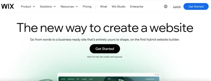
Wix does this by using a limited but eye-catching color palette, a contrasting CTA button with an enticing offer, and inspirational language.
Finally, be mindful of mobile users. I can’t tell you how discouraging it is to visit an online store on my tablet only to find that the CTA button overlaps with the pricing.
Copywriting Best Practices
Good design gets visitors to your landing page. Good copy gets them to convert. Here are the copywriting best practices for high-converting landing pages. My copywriting guide goes deeper on these concepts, but these fundamentals will get you started.
Include Very Important Attributes (VIAs):
Showcase the VIAs that appeal to visitors. Identify two to five key features, benefits, or pain points, and highlight them on the front page rather than overwhelming visitors with a long list.
Use the AIDA Model
AIDA stands for attention, interest, desire, and action. Apply this practice to content creation by using captivating graphics to drive attention, hold interest with valuable context, stimulate desire by connecting it to product benefits, and lead to action with a CTA.
Additionally:
- Format your copy so it’s easy to read: Use an organized structure full of headings, bullets, and quotes, and don’t be afraid of white space. This makes your site look less cluttered.
- Cut your fluff: Are you familiar with the phrase “kill your darlings”? You’re about to do that here by cutting anything that doesn’t add value. Use simple language and keep paragraphs short.
- Social proof: You can add things like media mentions, accreditations and awards, and usage stats.
- Don’t forget large language models (LLMs): You have to consider AI platforms and the LLMs that power them. LLMs tend to surface content that answers questions directly and quickly. Structure your copy around longer-form, question-based queries, and lead each section with a clear answer to improve your chances of appearing in AI-generated results.
Landing Page SEO Best Practices
SEO for landing pages comes down to a few essentials:
- Headings: Use H1, H2, H3, and H4 tags to give your page a clear structure for both readers and search engines. Include your main keyword in the title and H1, and work secondary keywords into your other headings.
- Meta tags: Your title tag and meta description tell search engines what your page covers and shape how it appears in search results. Keep them concise and keyword-relevant.
- Alt text: Alt text describes your images for search engines and screen readers. It supports both SEO and accessibility, so treat it as a requirement.
- Local SEO: If your landing page targets local customers, develop localized content that drives traffic to your door.

Search intent ties all this together. Every element on your page should reflect why someone is searching, not just what they’re searching for.
LLMs and AI search features reinforce this principle. Follow SEO fundamentals and focus on answering question-based queries directly to keep your landing page visible in AI results alongside traditional search.
How AI Is Changing Landing Page Optimization
While AI is rooted in traditional SEO concepts, it’s significantly changing the creative side of landing page workflows.
Copy that once took a week to draft can now be generated and tested in an afternoon. A/B testing now happens dynamically, with visitor traffic routed to the best-performing test variant in real time.
Additionally, search itself has shifted, with AI Overviews providing zero-click information that used to require a click-through.
Each change reshapes what you should build.
AI Tools for Copy and Page Creation
AI writing tools have dramatically sped up the timeline for drafting landing page copy. What used to take a week of copywriter iteration can now be a starting draft in minutes, with multiple variants ready to test by the end of the day.
Tools like Unbounce’s Smart Copy do this directly inside its page builder.
Fast doesn’t necessarily mean good, however.
Unbounce’s Conversion Benchmark Report shows that the correlation between difficult words on a page (three-plus syllables) and its conversion rate is 62 percent stronger than it was in 2020, and pages written at a fifth- to seventh-grade reading level convert more than two times higher than professional-level writing.
Raw AI output tends to be wordier and more formal than what converts. It’s great for accelerating the creation of variants, but think twice before skipping a human read that catches corporate voice creeping back in.
AI-Powered Testing and Traffic Optimization
Traditional A/B testing splits traffic 50/50 and waits for statistical significance before declaring a winner, which usually takes weeks and burns through budget on the losing variant the whole time.
Thankfully, we can avoid some of that loss now with AI-powered traffic optimization. Tools like Unbounce’s Smart Traffic analyze each visitor’s attributes in real time (device, referrer, campaign source, and browsing behavior) and route them to the variant most likely to convert for that specific profile.
That means you can run multiple variants without paying the full traffic cost of a losing test, allowing you to optimize continuously rather than in discrete two-week cycles.
<h3> AI Search and AEO Implications for SEO Landing Pages </h3>
Traditional SEO best practices still apply in AI search, but AI Overviews and answer engines create some nuance.
According to HubSpot, nearly 30 percent of marketers report decreased search traffic as consumers turn to AI tools, and over 92 percent are already optimizing for both traditional and AI-powered search.
For SEO landing pages, answer engine optimization (AEO) is now as impactful as classic on-page SEO.
Pages that answer specific questions directly and carry visible experience, expertise, authoritativeness, and trustworthiness (E-E-A-T) signals are what AI systems draw on when generating answers. The signals are concrete: author bylines, credentials, client results, and publish dates.
Clean heading hierarchy and structured data make it easier for AI to parse your content and pull from it accurately. Pages built on keyword density without substance get passed over.
What’s a Good Landing Page Conversion Rate?
A “high-converting landing page” only means something once you have a benchmark to measure against. That benchmark varies by industry and traffic sources, and it shifts depending on where the page sits in your marketing funnel.
Three data points can help you set realistic targets.
Average Conversion Rate by Industry and Channel
Unbounce research puts the median at 6.6 percent across all industries.
Email is the highest-converting traffic source at 19.3 percent on average, well ahead of paid social (12 percent) and paid search (10.9 percent). Google leads among paid search channels.
The device people use to find you plays a role, too. Unbounce found 83 percent of landing page visits happen on mobile, yet desktop still converts about 8 percent better on average.
The same report links simpler, shorter copy to higher conversion rates, which is why readable pages consistently outperform corporate-voice ones.
Conversion Rate by Industry: Ecommerce, SaaS, and More
Industry averages swing hard from the overall median. Statista puts the average conversion rate across all ecommerce sites at under 2 percent, a fraction of the 6.6 percent Unbounce reports across landing pages more broadly.
In ecommerce, skincare pages convert the highest at 2.4 percent (above average), while luxury apparel pages bottom out at just 0.3 percent.
The takeaway here is that chasing a single universal benchmark is a mistake. Compare your ecommerce conversion optimization against the tightest peer set you can find, then work on the specific friction points holding them back.
Cart Abandonment and Checkout-Stage Conversion Loss
According to the Baymard Institute, the average cart abandonment rate is 70.2 percent, based on 50 different studies.
Excluding pure window-shopping, the top reasons shoppers bail are:
- Extra costs like shipping and fees (40 percent)
- Slow delivery (20 percent)
- Distrust of payment security (19 percent)
- Forced account creation (18 percent)
- Overly long checkout flows (17 percent)
Baymard estimates that a better checkout design alone could recover $260 billion in lost ecommerce orders in the U.S. and the European Union.
The same friction points hit landing page sign-up and checkout flows, too. Anywhere you ask a visitor to take an action, reasons like those above are what keep them from following through.
Audit your page against that list.
Want to See These Best Practices in Action?
Reading about what works only gets you so far. To see how real brands apply these principles, check out my breakdown of over 30 landing page examples that convert, along with the specific design choices that make them work.
FAQs
What are high-converting landing pages?
High-converting landing pages are web pages designed to encourage visitors to take a specific action, such as signing up for a newsletter or making a purchase. These pages are optimized for conversion rates, designed to maximize the number of visitors who take the desired action.
What are the key components of a landing page?
Every landing page needs a clear headline, benefit-focused copy, a compelling CTA, and social proof. Trust signals and mobile-friendly design round out the essentials.
How do you create a high-converting landing page?
Start with a clear, compelling headline that highlights your product’s main benefit, and make sure your copy focuses on your target audience’s needs and pain points.
It’s also important to include high-quality images and videos that showcase your product in action and give visitors a sense of its capabilities, include a CTA, and keep text brief. Always A/B test content to see which option works best.
Finally, be sure to include testimonials, simplify navigation, and clearly state your value proposition.
What is a good landing page conversion rate?
Unbounce’s Conversion Benchmark Report puts the average conversion rate at 6.6 percent across all industries, but you shouldn’t be chasing a generic number. Your target should reflect your industry, since individual averages range from under 2 percent in ecommerce to over 10 percent in other verticals.
How can you improve your landing page conversion rate?
Start with a message match between your ads and page copy, since a mismatch kills conversions faster than any design flaw. Simplify your forms, then A/B test your headline and other elements.
Do landing pages help SEO?
Yes, when built for it. Landing pages that match specific search intent and load quickly can rank organically and drive long-term traffic beyond your paid campaigns.
Can you have too many landing pages?
The consensus is no. Digital marketing experts agree that it makes sense to have multiple landing pages. For instance, you might want to target different demographics.
Conclusion
There’s no single formula for a high-converting landing page. Don’t be afraid to test different approaches and see what works for your company and your offer.
Start by getting to know your buyers and what appeals to them. Get a sense for their pain points, and then build pages that solve them. Pair that with a CTA that compels them to take action and watch your conversions grow.
Apply the optimization elements in this guide, then let A/B testing strategies show you what converts best.
Recent Comments